cyberghostface (![[personal profile]](https://www.dreamwidth.org/img/silk/identity/user.png) cyberghostface) wrote in
cyberghostface) wrote in ![[community profile]](https://www.dreamwidth.org/img/silk/identity/community.png) scans_daily2018-08-04 01:26 pm
scans_daily2018-08-04 01:26 pm
The Killing Joke: Original vs Recolored

With the rerelease of 'The Killing Joke' a few years ago Brian Bolland opted to recolor the original art to his liking as John Higgins' coloring wasn't what he intended the book to look like. This of course has proven to be controversial and has been compared to George Lucas messing around with Star Wars.
I'm in the minority but I actually prefer the new recolors with some exceptions. The big difference is that the original is much more garish and psychedelic whereas the new colors are much more stark and muted.
My only real issue is that the original coloring is technically out of print and not at all available in a digital format. DC is rectifying this somewhat with 'The Absolute Killing Joke' which contains both coloring so hopefully the original will be available in some capacity in the near future.
The one bit where I prefer the original colors are the scenes with Joker's funhouse at the end.

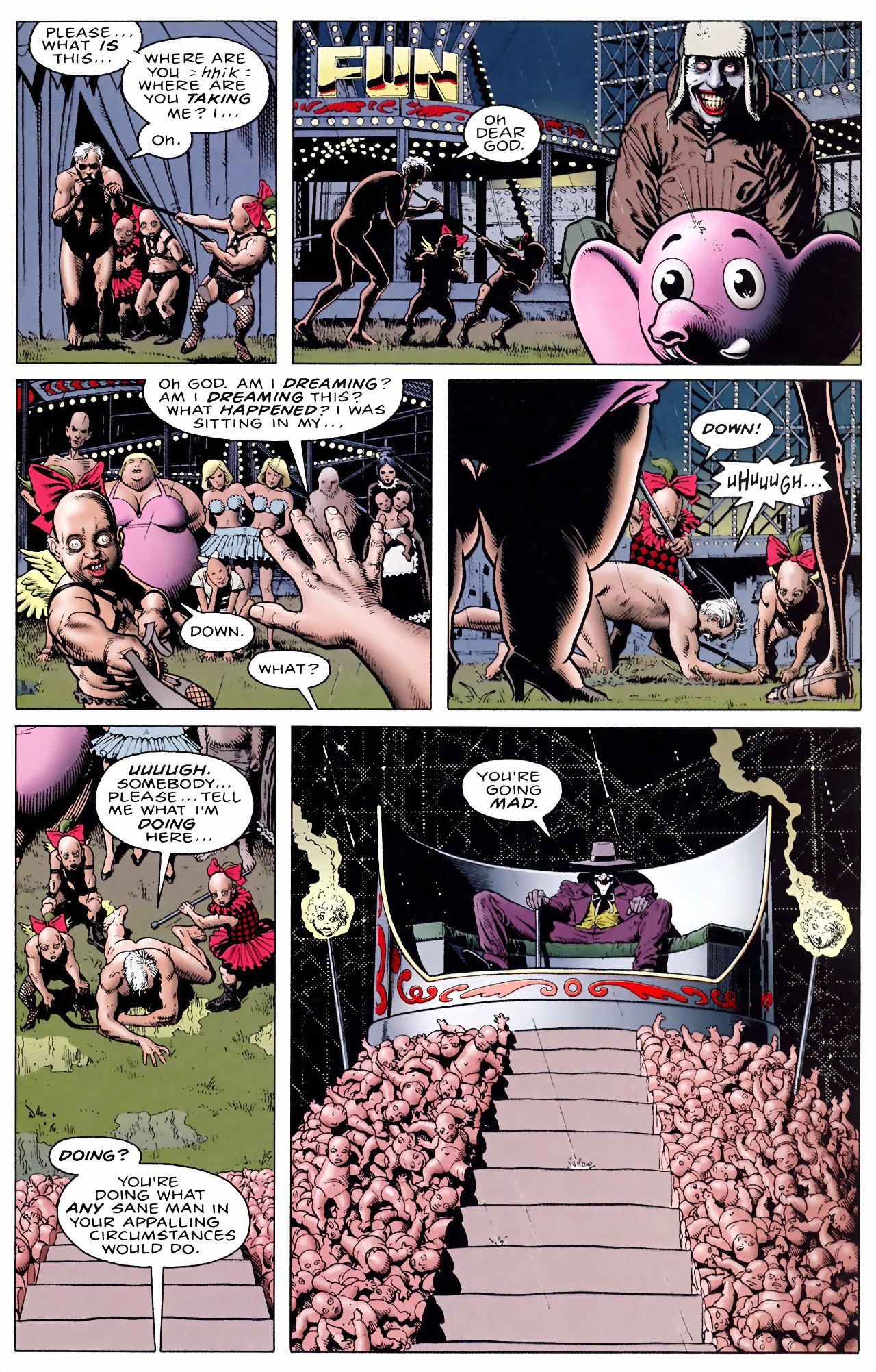


So yeah I think given the surroundings and what Joker's trying to do the garish colors work better and the more muted look doesn't capture the insanity as well. The "throne" with Joker doesn't have that oompf with the plain colors.
Another big change was the flashbacks; in the new recolor they're all black and white except for the color red culminating with the helmet and cape of the Red Hood.


Ultimately I really like the black and white coloring with use of red but Joker bleeding from the eyes as opposed to just crying was in my opinion an unnecessary change. I prefer the idea that Joker is laughing and crying at the same time.
I think the ending scene between Batman and Joker works better with the new colors.


From a visual perspective I just think the scene works better with the more gothic coloring over the garish one. I think it's a powerful moment and one of the best Batman/Joker scenes and the psychedelic coloring doesn't suit the story as much when we're out of the funhouse.
Curious as to which colors you prefer and why.
no subject
no subject
IME, it's, if not entirely restricted to, then at least most common, in 'mature audiences' books. At DC, mostly the ones that would become the first wave of Vertigo books. The more mainstream, or particularly kiddy books, had standard colouring.
no subject
Its hard for me to look at Beasts of Burden or The Little Endless and not think about how Brief Lives would have looked if Jill Thompson had colored herself or just had a colorist with more modern sensibilities and technology.