cyberghostface (![[personal profile]](https://www.dreamwidth.org/img/silk/identity/user.png) cyberghostface) wrote in
cyberghostface) wrote in ![[community profile]](https://www.dreamwidth.org/img/silk/identity/community.png) scans_daily2018-08-04 01:26 pm
scans_daily2018-08-04 01:26 pm
The Killing Joke: Original vs Recolored

With the rerelease of 'The Killing Joke' a few years ago Brian Bolland opted to recolor the original art to his liking as John Higgins' coloring wasn't what he intended the book to look like. This of course has proven to be controversial and has been compared to George Lucas messing around with Star Wars.
I'm in the minority but I actually prefer the new recolors with some exceptions. The big difference is that the original is much more garish and psychedelic whereas the new colors are much more stark and muted.
My only real issue is that the original coloring is technically out of print and not at all available in a digital format. DC is rectifying this somewhat with 'The Absolute Killing Joke' which contains both coloring so hopefully the original will be available in some capacity in the near future.
The one bit where I prefer the original colors are the scenes with Joker's funhouse at the end.

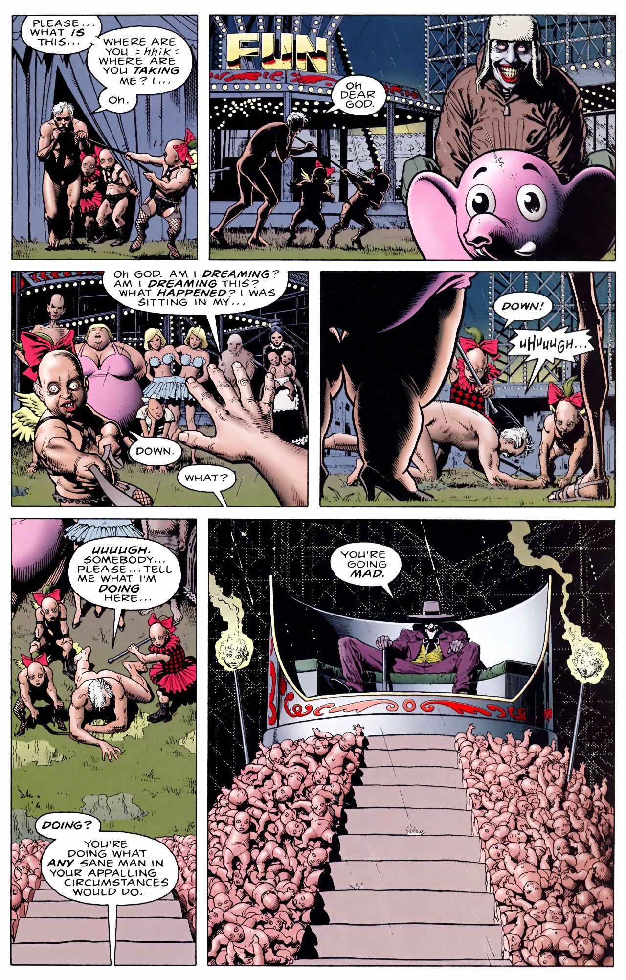


So yeah I think given the surroundings and what Joker's trying to do the garish colors work better and the more muted look doesn't capture the insanity as well. The "throne" with Joker doesn't have that oompf with the plain colors.
Another big change was the flashbacks; in the new recolor they're all black and white except for the color red culminating with the helmet and cape of the Red Hood.


Ultimately I really like the black and white coloring with use of red but Joker bleeding from the eyes as opposed to just crying was in my opinion an unnecessary change. I prefer the idea that Joker is laughing and crying at the same time.
I think the ending scene between Batman and Joker works better with the new colors.


From a visual perspective I just think the scene works better with the more gothic coloring over the garish one. I think it's a powerful moment and one of the best Batman/Joker scenes and the psychedelic coloring doesn't suit the story as much when we're out of the funhouse.
Curious as to which colors you prefer and why.
no subject
Based on the examples here and what I've seen from elsewhere, I think I would prefer a mix. The original colors work when we are in Joker world, which is the garish colorful place, but the more muted colors work better in the 'real' world setting. For example, that birth of the Joker would work better for me if the first half was in the new colors, but that final Joker image in the old colors.
no subject
Edited to add: I'm glad that the forthcoming Absolute edition will feature not only both coloured versions but also Moore's complete script. (They may as well publish the script because it was leaked a few years ago on Tumblr and before that, hard copies were readily available on eBay.) The script is a fascinating read in its own right, as it sheds light on Moore's intentions for the story, puts to rest the question of whether Batman kills Joker at the end (he doesn't, unless we insist on "death of the author" interpretations), and gives us yet more tidbits of Moore's dark humour (e.g. in the script the three sideshow dwarves are nicknamed Huey, Dewey and Louie).
no subject
Recolor Sandman: Huge selling point for Absolutes.
Recolor Killing Joke: BURN IT! BURN IT WITH FIRE!
Having said that, I also mostly prefer the new version. Sure I don't like the new take on the Joker laughing while holding his head panel (for a bunch of reasons) but I do like that the new images looks like less of a rainbow nightmare.
Oh well, can we all at least come together as a fandom and agree that the cartoon adaptation is an abomination?
no subject
no subject
no subject
If I were to do it I'd probably have something more similar to BTAS for the art style. They were trying to find a compromise between Bolland and something that would be easier to animate but it just looked cheap at times.
Someone on YouTube did this edit with the original color and I think it might have worked.
https://www.youtube.com/watch?v=1_r-qsxGiKY
no subject
Not sure what I'd think of using the B:TAS style for the animation, but I agree it's pretty much impossible to really capture the spirit of Bolland's meticulously detailed line art in a cartoon adaptation, unless they were to use the anime (or John Kricfalusi) technique of painted stills for key moments. They could do all the cross-hatching they wanted in those. :D
no subject
Before the movie came out I saw a lot of people complain that they didn't just use Bolland's art style. I see this complaint nearly every time they do one of these movies.
After the movie I think most people just focused on the part I don't like; the gross Batgirl retcon they added to pad out screen-time. I didn't like it when it was implied in the Batman Beyond show (or when they confirmed it in the spin-off comics) and I still don't like it here. I'm not sure what's worse; that she's his student, that she's his adopted son's ex, or that she's his friend's daughter. It takes a lot to make me hate Conroy's Batman but this relationship manages to do it.
no subject
no subject
no subject
no subject
no subject
no subject
IME, it's, if not entirely restricted to, then at least most common, in 'mature audiences' books. At DC, mostly the ones that would become the first wave of Vertigo books. The more mainstream, or particularly kiddy books, had standard colouring.
no subject
Its hard for me to look at Beasts of Burden or The Little Endless and not think about how Brief Lives would have looked if Jill Thompson had colored herself or just had a colorist with more modern sensibilities and technology.
no subject
Sandman gets the red-carpet treatment because Gaiman is probably THE most high-powered author willing to take DC's calls on a regular basis. Though even then, there are quibbles to be had - CBR did a quick overview on some of the artists' remasterings a few years back:
https://www.cbr.com/comics-you-should-own-sandman/
And as I mentioned a few weeks back, recolored Moore Swamp Thing is a pretty big letdown compared to the murky, crinkled atmosphere of the original.
no subject
Intense vivid and wild colors to represent pure surreal insanity and nightmarish setting...
Verus a dull and dark tone to suit the the sense of dread and hopelessness....
no subject
no subject
no subject
no subject
Still, there's a difference between "Someone goes through horrible stuff and it affects him or her" and "Someone goes through horrible stuff and he or she goes insane."
Rolling back the clock, I see Batman hating Hal Jordan for going insane after Coast City was destroyed BECAUSE of the Joker's "One Bad Day" theory. That makes more sense than "Batman hated Hal for not being afraid of him."
no subject
no subject
IMO the final joke about the two escaped patients is one of the most tragic and poignant takes on the Batman/Joker relationship.
no subject
no subject
One of the reasons why he’s pooh-poohed TKJ is he says it doesn’t have a greater message beyond “Batman and Joker are more similar than they’d like to admit” which according to him is only profound to Batman fans and meaningless to anyone else. To me that’s kind of a silly criticism, a story about the Batman and Joker doesn’t need to have something new to say on the human condition but he’s entitled to his opinion.
no subject
The changes for me messed the Timeline up a bit
However the story was set in a very specific time frame with it effectively setting up Barbara's transition into becoming Oracle. Bruce wouldn't lose the octave for a while yet in the old continuity. Plus you want the distinction of that 'present' day Batman contrasted to the early one in the Red Hood encounter.
So changing his costume just to make it more 'grimdark,' without even considering the time period it's set in, just undermines it all for me, for the silliest of reasons. So unnecessary.
Re: The changes for me messed the Timeline up a bit
If you don't know what I'm talking about, I swear I'm not making fun of you, but I know only one guy who's ever had that complaint.
no subject
The recoloring is...fine, but it makes the whole thing look too clean and samey. The originally coloring makes the book stand out from other comics.
no subject
On the one hand, I get the idea of crazy colored lights and perhaps the one place I think he went too subtle in the 'dark ride' scene, where the outlandish colors worked much better. I'd prefer more fun house colors there, but still preserving Bolland's detail work.